99 Little Orange – Technical Business Case
- IVAN CHAVEZ
- January 8, 2023
- Projects
Introduction
Hello guys,
It’s Ivan, and in this post I want to share with you a technical test I have made for a hiring process for a big Chinese mobility company. So, here we go…
Business case presentation & resources
The business case were delivered by email in a PDF within detailed instructions.
Basically, the business case to solve is organized in 2 parts: SQL Proficiency and Analytics skills.
SQL proficency – They provide you database credentials for a dummy dataset and ask some data related questions.
Analytics skills – According to the credentials and data provided, a business case is presented, and answering backing your recommendations in data is evaluated.
Resources:
99 Data Analytics Challenge – Challenge detailed instructions – “.docx” file in Google Drive
Miro board – Step-by-step documented process
Tableau dashboard – Dashboard with navigation functionality published in tableau public
Note: all the images in the post can be found in Miro board, and in this post will only find comments and insights related to them.
Raw data exploration
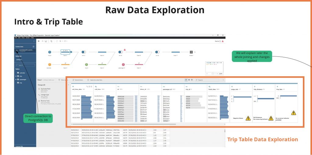
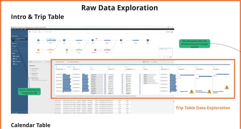
Using tableu prep, a direct connection to PostreSQL DB was made. Then proceeding to analyze and checking data distribution for each table.
Intro & Trip Table – 9 fields found and noticed issues in 3 fields:
surge rate, for negative values
trip distance, for null distances and no measuring system indicator
trip fare, no currency indicator
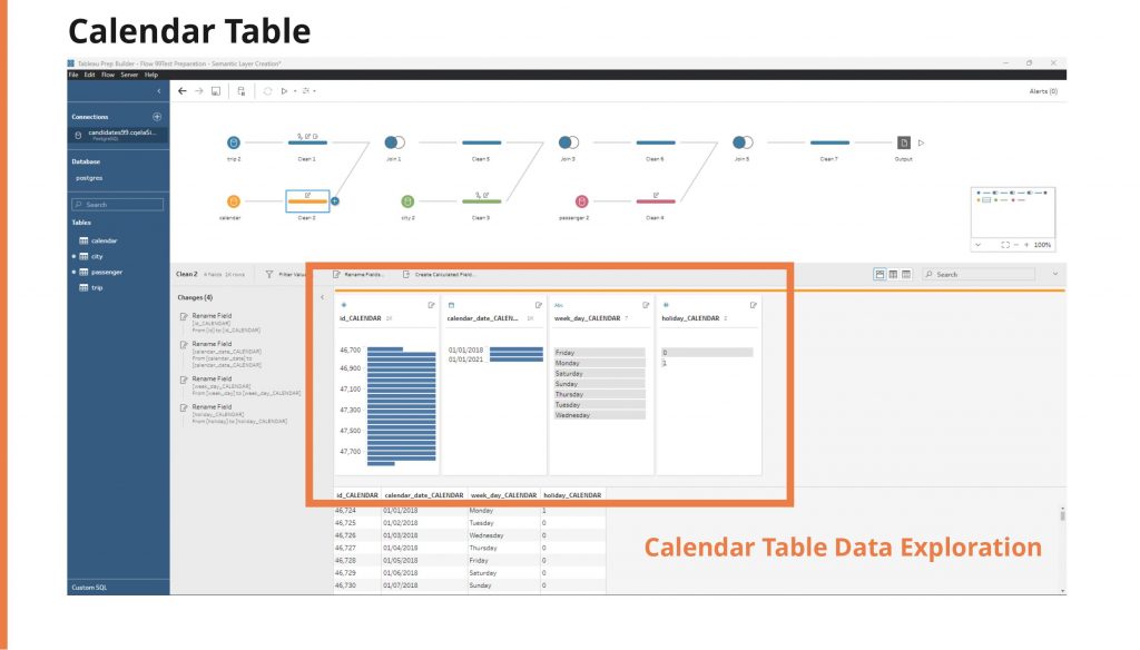
Calendar Table – 4 fields found, a field renaming were made containing “CALENDAR”
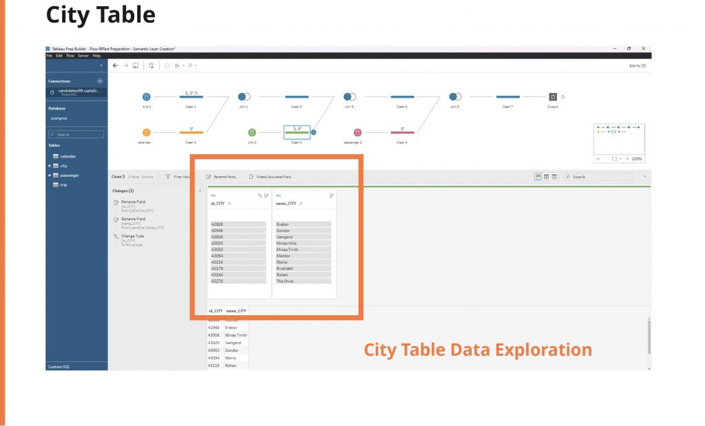
City Table – 2 fields found, a field renaming were made containing “CITY”
Passenger Table – 2 fields found, Null records found in first call time and noticed some of them linked to passenger ID had older dates than dataset provided, a field renaming were made containing “PASSENGER”
Raw data exploration notes
Data Issues
- surge_rate – Contains negative numbers
- surge_rate – Contains Nulls
- trip_distance – Null distances
- trip_distance – No measuring indicator
- trip_fare – No currency indicator provided
- city_id – is a varchar data type in trip table, while id in city table which is the “pk” is an integer.
Passenger Table
- first_call_time – Null Records
Data issues solutions proposed and educated guessing
Trip Table
surge_rate
- Option 1: Run some scatterplot testing in order to figure out if there is a relationship for negative surge rates with positive numbers and determinate equivalency
- Option 2: Exclude nulls and negatives as they represent less of 1% (8609) of records
- Option 3: Keep using the records as it as long no business questions needs a indicator as surge_rate
trip_distance
- Option 1: Exclude nulls as they represent 1% (10491) of records
- Option 2: Keep using the records as it as long no business questions needs a indicator as trip_distance
- Option 3: Use the number as it, without indicating measuring system and ask later to complement the indicators
trip_fare
- Option 1: Exclude nulls as they represent 1% (10491) of records
- Option 2: Keep using the records as it as long no business questions needs a indicator as trip_distance
- Option 3: Use the number as it, without indicating measuring system, and ask later to complement the indicators.
city_id
- Option: In order to follow a right data architecture, I would advice to change city_id (at trip table) to integers to perform data processing while joining data.
Documentation issues
Calendar Table – calendar_date – Field is date format and does not match directly with trip table with a timedate variable
Trip Table – trip_date – Is not documented at Data dictionary provided
Complementing provided documentation

Data Analytics Challenge @ Resources is the complemented documentation with indicated editions.
Determining mathematically surge rate equivalencies
Using tableau a scatter plot chart were created with trip fame and trip distance, in order to determine surge rate equivalencies mathematically, a slope comparison were made.


Data flow building for semantic layer creation

Part I – Technical skills – SQL code
What is the average trip cost of holidays? How does it compare to non-holidays?
SELECT cr.holiday, avg(t.trip_fare)
 FROM  (
      SELECT
     t.id
    ,t.driver_id
    ,t.passenger_id
    ,cast (t.city_id as integer) as city_id
    ,t.call_time
    ,t.finish_time
    ,t.surge_rate
    ,t.trip_distance
    ,t.trip_fare
     ,date(date_trunc('day',call_time)) as call_time_date
      ,date(date_trunc('day',finish_time)) as finish_time_date

             FROM trip t
    ) t
       LEFT JOIN passenger p ON 1=1 and t.passenger_id = p.id
       LEFT JOIN city  c ON 1=1 and t.city_id = c.id
       LEFT JOIN  calendar cr ON 1=1 and  t.call_time_date = cr.calendar_date
WHERE 1=1
GROUP BY cr.holiday
ORDER BY 1

--Holiday, avg
--0,5.247632961740106
--1,5.4488930923738765
Find the average call time of the first time passengers make a trip
select * --AVG(MIN_DIFF)
from (
     SELECT t.id,t.call_time, t.passenger_id, finish_time,
        EXTRACT(EPOCH FROM t.finish_time-t.call_time)/3600*60 AS min_diff,
        ROW_NUMBER () over(PARTITION BY t.passenger_id ORDER BY t.passenger_id,t.call_time ASC) AS NUM
     FROM trip t
   --    LEFT JOIN  passenger p ON 1=1 and t.passenger_id = p.id
       where 1=1
         and t.passenger_id in ('00002b66','0000497f','0000883c')
         )a
       where 1=1 and num =1
Find the average number of trips per driver for every week day
SELECT cr.week_day,p.driver_id, count(1)--avg
 FROM  (
      SELECT
     t.id
    ,t.driver_id
    ,t.passenger_id
    ,cast (t.city_id as integer) as city_id
    ,t.call_time
    ,t.finish_time
    ,t.surge_rate
    ,t.trip_distance
    ,t.trip_fare
     ,date(date_trunc('day',call_time)) as call_time_date
      ,date(date_trunc('day',finish_time)) as finish_time_date

             FROM trip t
    ) t
       LEFT JOIN passenger p ON 1=1 and t.passenger_id = p.id
       LEFT JOIN city  c ON 1=1 and t.city_id = c.id
       LEFT JOIN  calendar cr ON 1=1 and  t.call_time_date = cr.calendar_date
WHERE 1=1
GROUP BY cr.week_day,p.driver_id
ORDER BY 1
Which day of the week drivers usually drive the most distance on average?
SELECT cr.week_day, avg(t.trip_distance)
 FROM  (
      SELECT
     t.id
    ,t.driver_id
    ,t.passenger_id
    ,cast (t.city_id as integer) as city_id
    ,t.call_time
    ,t.finish_time
    ,t.surge_rate
    ,t.trip_distance
    ,t.trip_fare
     ,date(date_trunc('day',call_time)) as call_time_date
      ,date(date_trunc('day',finish_time)) as finish_time_date

             FROM trip t
    ) t
       LEFT JOIN passenger p ON 1=1 and t.passenger_id = p.id
       LEFT JOIN city  c ON 1=1 and t.city_id = c.id
       LEFT JOIN  calendar cr ON 1=1 and  t.call_time_date = cr.calendar_date
WHERE 1=1
GROUP BY cr.week_day
ORDER BY 1
What was the growth percentage of rides month over month?
SELECT
 fecha
,rides
,rides_ant
,rides / rides_ant AS variation
	 FROM  (
          SELECT
         t.id
        ,t.driver_id
        ,t.passenger_id
        ,cast (t.city_id as integer) as city_id
        ,t.call_time
        ,t.finish_time
        ,t.surge_rate
        ,t.trip_distance
        ,t.trip_fare
         ,date(date_trunc('day',call_time)) as call_time_date
          ,date(date_trunc('day',finish_time)) as finish_time_date

                 FROM trip t
        ) t
           LEFT JOIN passenger p ON 1=1 and t.passenger_id = p.id
           LEFT JOIN city  c ON 1=1 and t.city_id = c.id
           LEFT JOIN  calendar cr ON 1=1 and  t.call_time_date = cr.calendar_date
			WHERE 1=1
			GROUP BY holiday
			ORDER BY 1
		)a
	)a
Optional. List the top 5 drivers per number of trips in the top 5 largest cities.
SELECT * FROM(
SELECT DRIVRS, count(t.id),ROW_NUMBER () over(PARTITION BY cr.calendar_date,t.driver_id ORDER BY NUMBER_TRIP DESC) AS NUM --ROWNUMBER  POR NUMERO DE VIAJES; WHERE ROWNUMBER <=5
FROM (
		SELECT DRIVRS, count(t.id) AS NUMBER_TRIP
		 FROM  (
              SELECT
             t.id
            ,t.driver_id
            ,t.passenger_id
            ,cast (t.city_id as integer) as city_id
            ,t.call_time
            ,t.finish_time
            ,t.surge_rate
            ,t.trip_distance
            ,t.trip_fare
             ,date(date_trunc('day',call_time)) as call_time_date
              ,date(date_trunc('day',finish_time)) as finish_time_date

                     FROM trip t
            ) t
               LEFT JOIN passenger p ON 1=1 and t.passenger_id = p.id
               LEFT JOIN city  c ON 1=1 and t.city_id = c.id
               LEFT JOIN  calendar cr ON 1=1 and  t.call_time_date = cr.calendar_date
		WHERE 1=1
		GROUP BY holiday

		) R_N
)TOP
WHERE 1=1
AND NUM<=5
Tableau look and feel considerations
From the official site, a hex color extraction were made using imagecolorpicker.
The color pallete hex extracted were consolidated and documented using coolors.co.
Using Canva, different background logo and resolutions were made also a variation of an image used for this post featured image.


Tableau embedded dashboard
All the following images here found has been extracted from original tableau dashboard published at tableau public and embedded in this site.
You can check this tableau public posted dashboard @ Tableau dashboard in the resources section.
![[DH] Q1](https://public.tableau.com/static/images/99/99LittleOrange-BusinessCase/DHQ1/1_rss.png)
Part I – Technical skills – Tableau


In the city table provided appeared more than 6 cities, but only 6 of them had data who matched the main trip table.
Gondor is the lowest city in terms of total trips for the timeframe provided, with 13.738% (318,499) of records.
Top city is The Shire with 21.112% (489,459) of records.
Part II – Analytical skills – Tableau
Let’s say it’s 2019-09-23 and a new Operations manager for The Shire was just hired. She has 5 minutes during the Ops weekly meeting to present an overview of the business in the city, and since she’s just arrived, she asked your help to do it. What would you prepare for this 5 minutes presentation?
Educated guesses made:
- As is Monday, 2019-09-23 and is a new Operations Manager Just for The Shire, the data shown there is from W38 which is the latest week closed considering Sunday to Saturday weekends in Gregorian calendar.
- The slides must be easy to understand for a 5 minutes timeframe in an operations manager’s meeting.
- Considering the dataset provided and thinking which could be the main indicators for an operations manager, here’s my answer:

Operative KPI’s In this Dashboard:
- Total ran distance in a city
- WoW difference for ran distance
- Total fares charges (revenue)
- WoW difference for fares charges (revenue)
- Total rides per week
- WoW difference for city rides
- Total city revenue
- WoW difference for revenue
Slide 1:
- I would provide her a link to our published tableau dashboard within the organization, and prior to present as the final user, I would ask If I could explain to her what this dashboard is about. Probably is not rocket science but is “better safe than sorry” and make sure she understands what is going to present in the meeting.
- In case she doesn’t have a clue what tableau is, I would propose to export this Operative KPI’s to PDF or Image, so she could share comfortably this information.

The Shire Heavy Users Performance KPI’s:
- Top Passenger ID Per Rides
- Top Passenger ID Weekly Rides
- Top Passenger ID Distance
- Top Passenger ID Revenue
- Top Driver Per Rides
- Top Driver Per Weekly Rides
- Top Driver Per ID Distance
- Top Driver Per ID Revenue
Slide 2:
- This slide shows top-heavy users metrics for passengers and drivers.
- The idea is with 2 slides could have enough operative metrics to share information and insights in 5 minutes timeframe.
She also mentioned she has a budget to invest in promoting the business. What kind of metrics and performance indicators would you use in order to help her decide if she should invest it into the passenger side or the driver side?

Insights:
- The Shire, is top rides compared with other cities
- The Shire, have an average passengers/drivers ratio
- The shire, is below inferior quartile in avg. Surge rate, it means avg. Cheap trips and not high demand.
- The shire, have a decreasing passengers/drivers ratio, so more passengers are needed.
Recommendations:
- I would advise to the Operations Manager, due the data is indicating a flat-decreasing trend in rides number, to focus budget on new passenger’s user acquisition.
- Flat surge rate and being lowest in The Shire city, means there are not enough demand for increasing this indicator.
- I would advise asking other Cities Operations Manager in order to have a benchmark regarding this indicator.
- Having flat-decreasing avg. Trip Fare means rides could being cheaper due to low surge rate.
Complementing backed data recommendations using following dashboard
- Flat-decreasing trend for rides number
- Avg. Trip Fate, trending moving below median and inferior quartiles
- Avg. Surge ratio keeps flat
One month later, she comes back, super grateful for all the helpful insights you have given her. And says she is anticipating a driver supply shortage due to a major concert that is going to take place the next day and also a 3 day city holiday that is coming the next month. What would you do to help her analyze the best course of action to either prevent or minimize the problem in each case?

Ivan’s Comments:
- Excluding first record from dataset due out layer, we can see 3 vizes in this dashboard analyzing Rides #, Trip Fares & Surge Rates.
- As we only have 3 holidays in this 5 month dataset, I would say in first hand there is no enough data to make a certain decision, but there are some interesting insights.
- The number of rides in the shire doesn’t seem increasing over time, which means there are a user increasing opportunity.
- Holidays in average are higher tan non holidays, but the difference is not that high in relative terms, the avg trip fare seems decreasing which means cheaper trips.
- The Shire is too below average in avg surge rate.
Ivan’s Plan:
For next day concert, I propose to send email and push notification to drivers for The Shire city about this opportunity aiming to aware them for incoming high demand, then let the day go as normally, having a team back meeting a day after for checking the data, and trying to figure out trips number increased as expected and comparing with surge rate and trip fare averages. Having a benchmark with other cities will help to take better decisions.
For next incoming holidays, I would repeat the same strategy if team determines worked, If this strategy worked but still uncovered demand (checking avg fare and surge rate), I would discuss with product management to keep doing this and test the possibility of offering to drivers a base remuneration if they do at least 50% of average daily trips. Keeping iterating this and modifying variables as holidays and non holidays, changing the base remuneration and % of avg daily trips.

IVAN CHAVEZ
Hi there! If you’re into the data world like me, then you’re in the right place.
In this website, we’re going to dive into the exciting world of DataOps & Analytics. From the latest trends and innovations to practical tips and tricks, I got everything you need to stay on top of the game.
So grab a cup of coffee (or your beverage of choice), get comfortable, and let’s get started!