Causes of Death – Our World In Data
- IVAN CHAVEZ
- January 8, 2023
- Projects
Hello guys,
It’s Ivan again, here is my last Tableau Public project, a new tableau dashboard.
![[DH 0] MENU](https://public.tableau.com/static/images/Ca/CausesOfDeath-OurWorldInData/DH0MENU/1_rss.png)
WWorld Health Organization – who.int – Coolors Palette
As embed visualizations in sites doesn’t work that well for custom dashboard resolutions, you click here or in the image you will be re-directed to Tableau Public and will be able to play and discover insights by your own.
This is by far the most time-consuming visualization I have made, due I was experimenting by the first time how to use navigation buttons, using annotations, applying color and design principles, and trying to simulate World Health Organization (who.int Look and Feel).
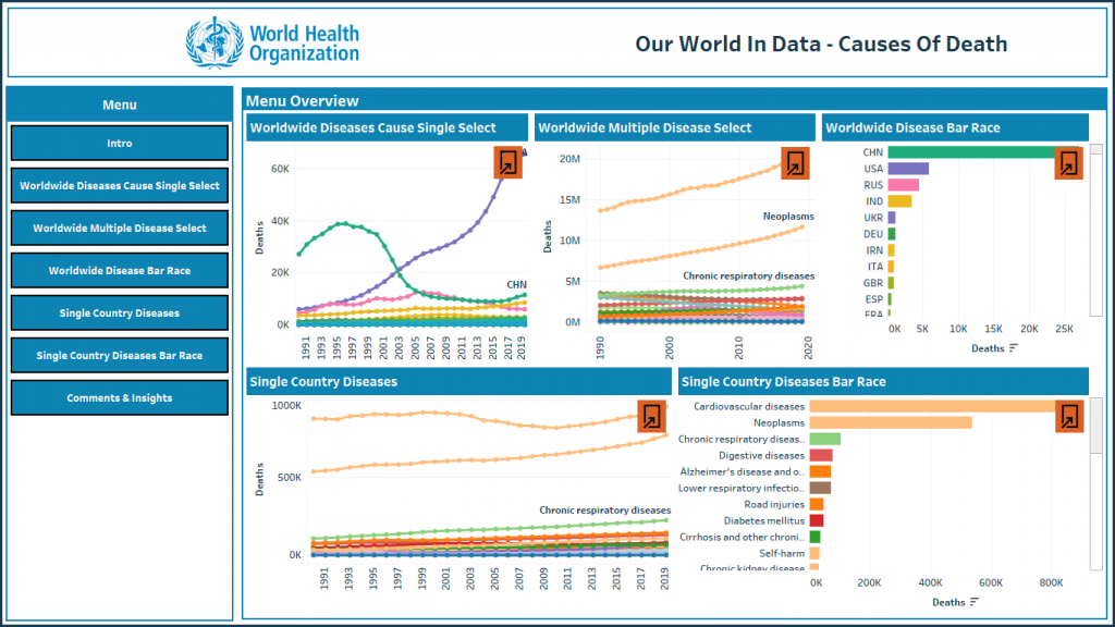
This dashboard has 8 sections:
Menu, this is the “Landing Dashboard” and contain as miniatures 5 mini visualizations with an open button who helps to navigate through dashboard.
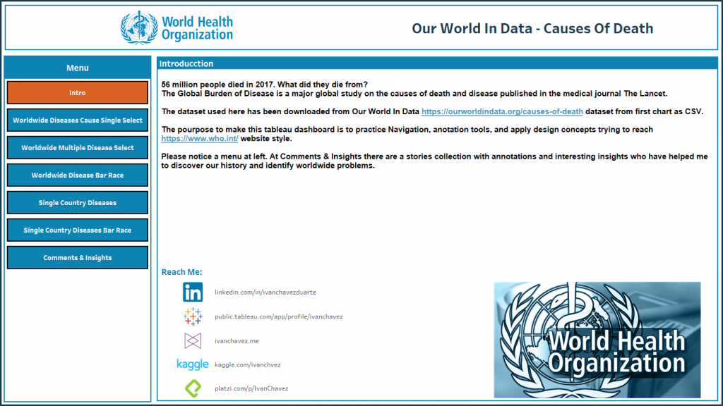
- Intro, a summary about dataset, data sources, who.int logo, and social media.
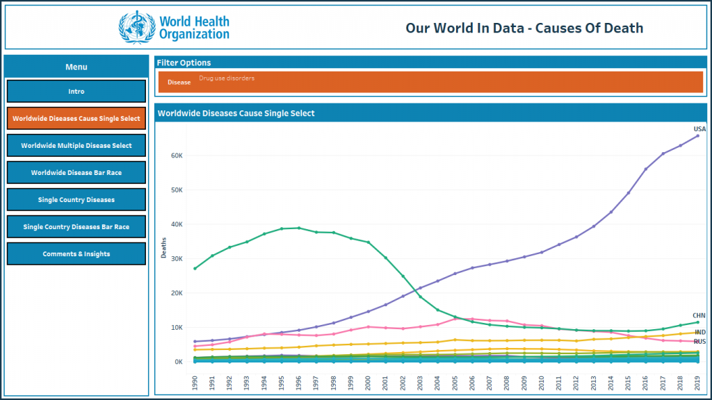
- Worldwide Diseases Cause Single Select, pick a single disease and check behavior for all countries.
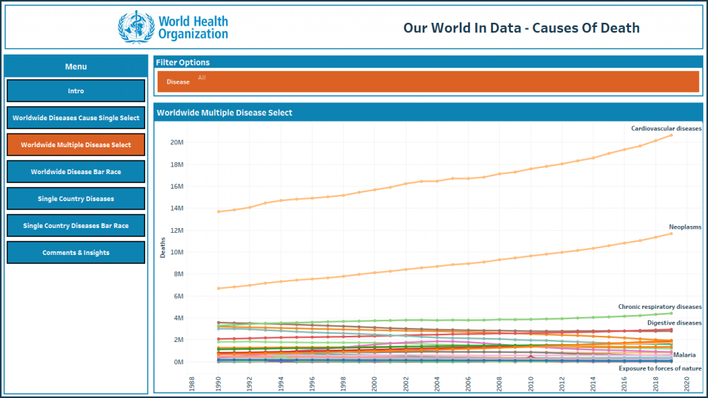
- Worldwide Multiple Disease Select, pick 1 or more diseases and compare their behavior worldwide.
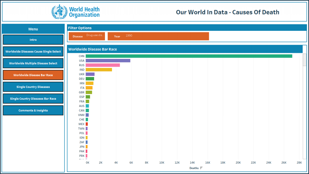
- Worldwide Disease Bar Race, pick a disease and play with year and check how countries handled the disease.
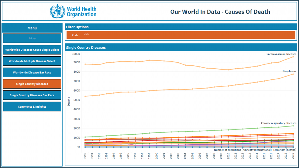
- Single Country Diseases, pick a country and see their top diseases.
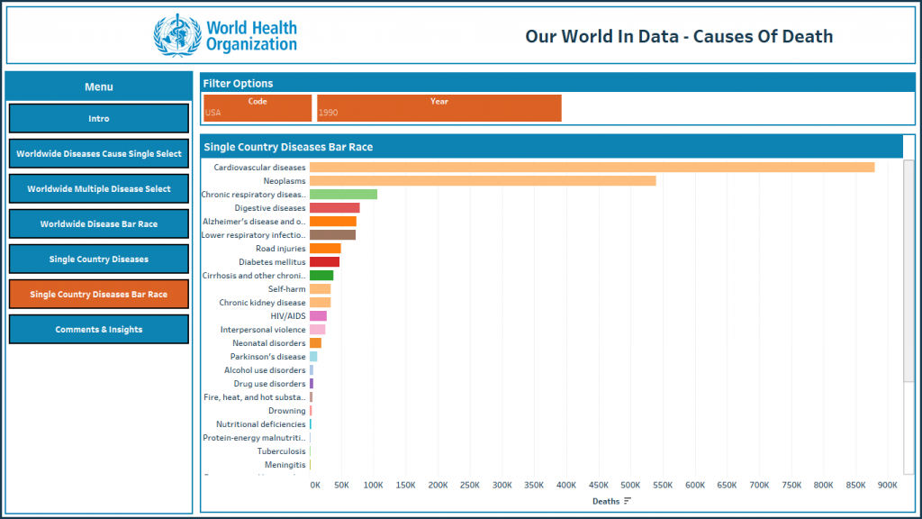
- Single Country Diseases Bar Race, pick a country and check how handled all diseases through years.
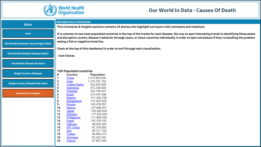
- Comments & Insights, the first page is introductory and there are no filters, this is a story’s collection, each story have my annotations and my insights identification.

IVAN CHAVEZ
Hi there! If you’re into the data world like me, then you’re in the right place.
In this website, we’re going to dive into the exciting world of DataOps & Analytics. From the latest trends and innovations to practical tips and tricks, I got everything you need to stay on top of the game.
So grab a cup of coffee (or your beverage of choice), get comfortable, and let’s get started!