Canada Express Entry Rounds of Invitations Analysis
- IVAN CHAVEZ
- January 8, 2023
- Projects
Hey, this is my first project I document using my WordPress site, so I am excited to have you over here!
EXPRESS ENTRY DISCLAIMER
- The Information shown here comes from the official Canadian government (canada.ca). Please check this site, to see the invitation round’s information, which is the primary data source used for this project.
- The project here shown is only for educational purposes, if you’re looking for an immigration advice this is not the right site, please check canada.ca.
- I am not an immigration consultant; I am not related with any immigration consultant. Please check ICCRC-CRCIC for a certified consultant.
- This project is only for educational purposes, data and insight shown only represents interesting things I have found while analyzing data.
INTRO
If you have had the interest to move to Canada probably you have heard of Express Entry (EE) program. If not, don’t worry and let me explain.
Express Entry Program looks to promote Canadian immigration through selecting the high-skilled individuals through a Comprehensive Ranking System (CRS), where the Canadian government increase or decreases some variables to satisfy their demand of skilled workers.
The Express Entry performs invitation rounds about every 2 weeks and selects from a pool the most qualified candidates according to the CRS. Here data such as date, round number, immigration program, invitations issued and lowest CRS score information is published through their official website. And that is the main data I have used to make this tableau public visualizations.
EXPRESS ENTRY ROUNDS – DASHBOARD RESOURCES
- Official Canadian Government Site for EE Rounds data:
- Copy of the Official Canadian Government – Google Sheet – Data cleaned and structured to used as live data source.
- Color pallete obtained from the oficial canada website and used coolors.co to share.
WHAT THIS PROJECT IS ABOUT
This is about sharing insights related to the Express Entry system the data source is around 200 records there are some data patterns I would like to share with you.
Is important to say to develop these visualizations I have use Tableau desktop and published the final dashboard in tableau public. Maybe you have noticed I have used google sheet as data source for these visualizations, so it could help me to:
- Having a easy access to append new information manually.
- Avoid local data source refresh and re-upload.
- Use a tableau public live connector feature using google sheets.
If you’re reading this and know how to do web scrapping in the official website, please let me know I would like to perform and automate this project so the information could be updated automatically.
Reach me at: hola@ivanchavez.me
Ok, after the adverstment there is an image of the dashboards:
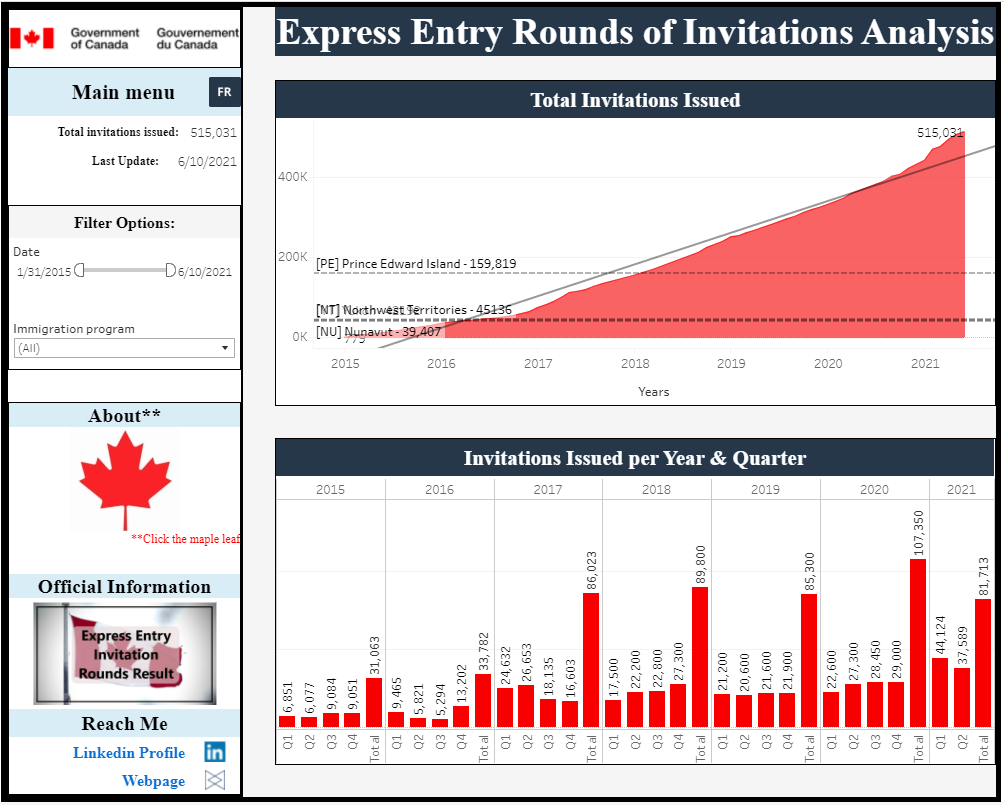
[Dashboard] Express Entry Rounds of Invitations Analysis
Important
Click the image to open the tableau public visualization.
Dashboard features of this Express Entry Rounds visualization:
* The Dashboard shows the last update.
* Total invitations issued number shown according to the filters used.
* You can select a range of date filter.
* Also can filter using immigration program.
* There are some reference lines according to the province/territory total population according to estimations.
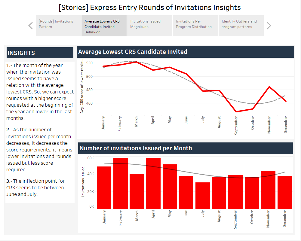
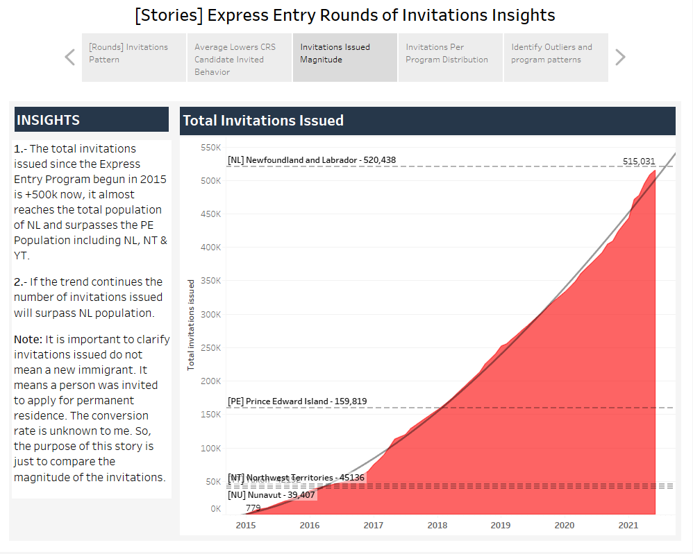
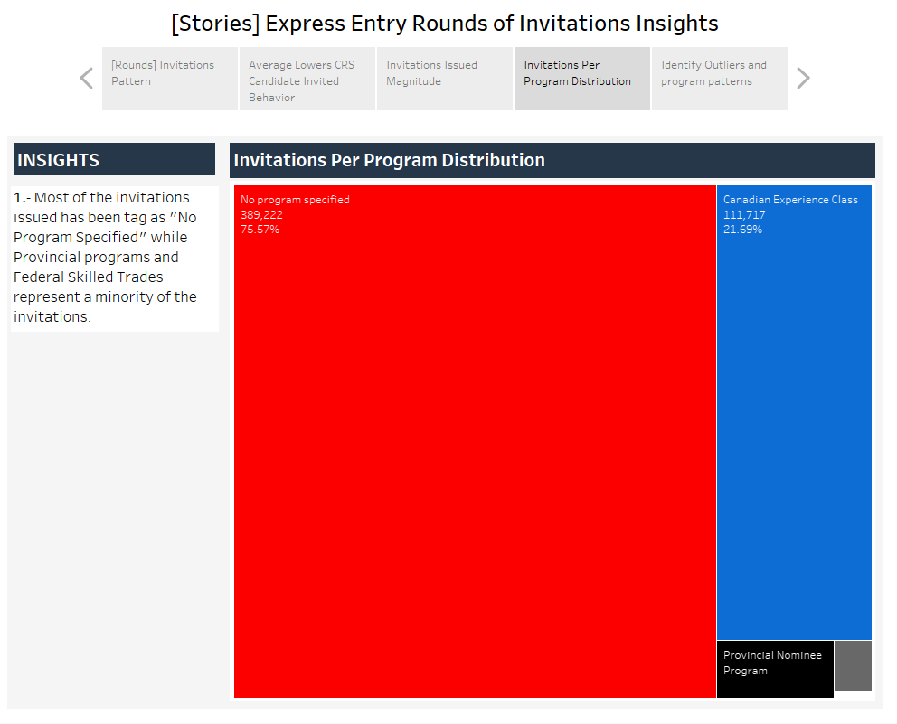
[Stories Collection] Express Entry Rounds of Invitations Insights

Important
Click the image to open the tableau public visualization.
Dashboard features to consider:
* The stories are a recap of 5 dashboards, each dashboard contains notes and insights or ideas to share.
* If you move your cursor over the viz, it will display additional information.
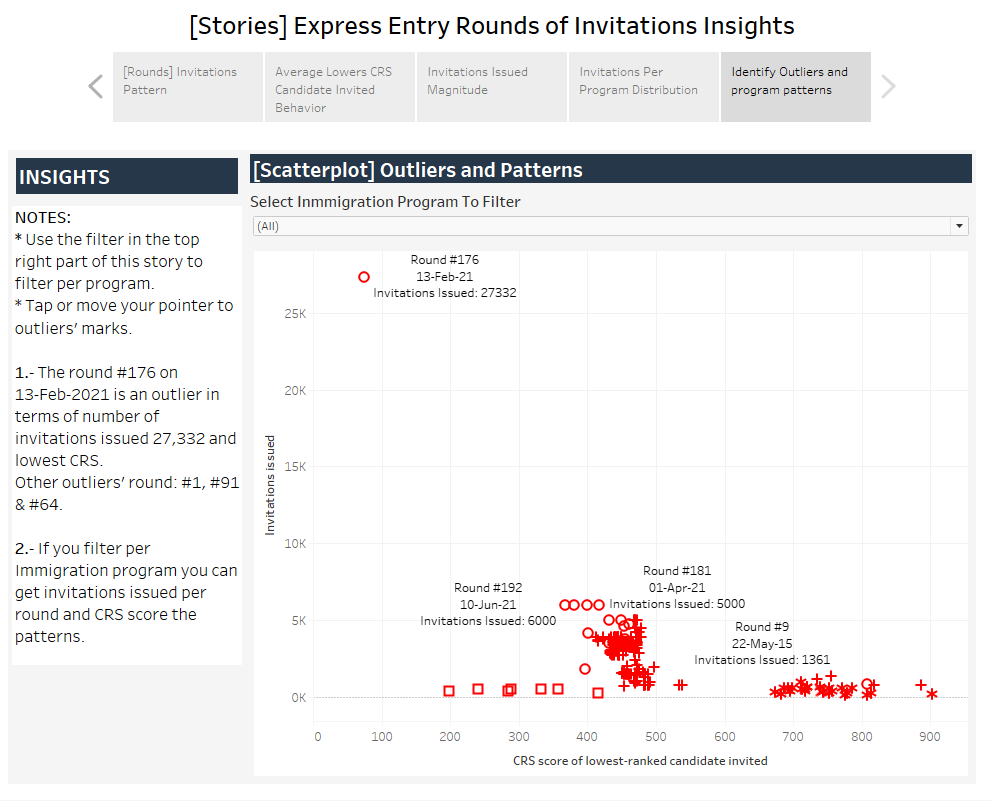
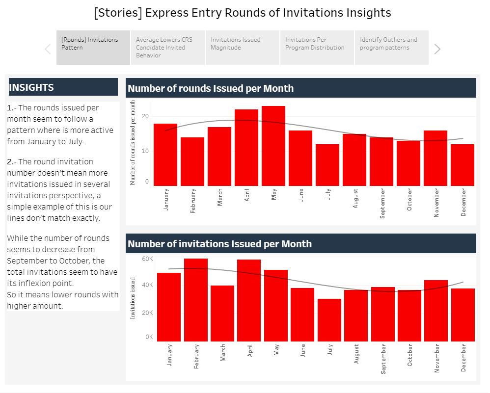
Express Entry Rounds – Stories Image Gallery

IVAN CHAVEZ
Hi there! If you’re into the data world like me, then you’re in the right place.
In this website, we’re going to dive into the exciting world of DataOps & Analytics. From the latest trends and innovations to practical tips and tricks, I got everything you need to stay on top of the game.
So grab a cup of coffee (or your beverage of choice), get comfortable, and let’s get started!